Graphic Design
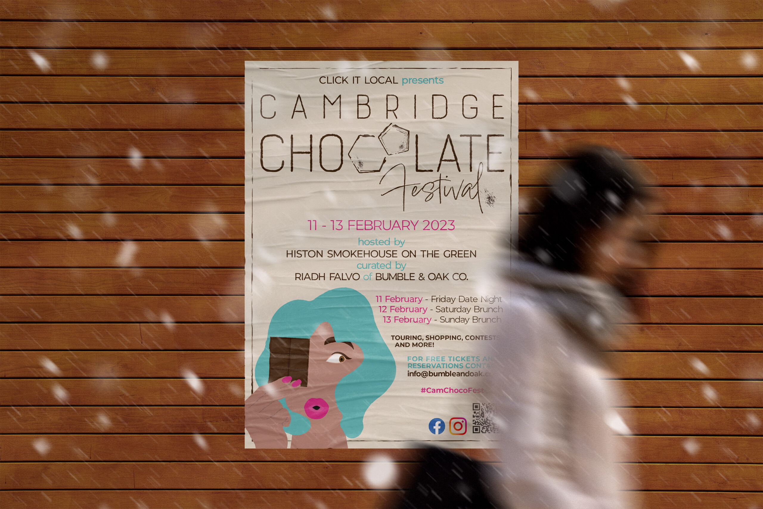
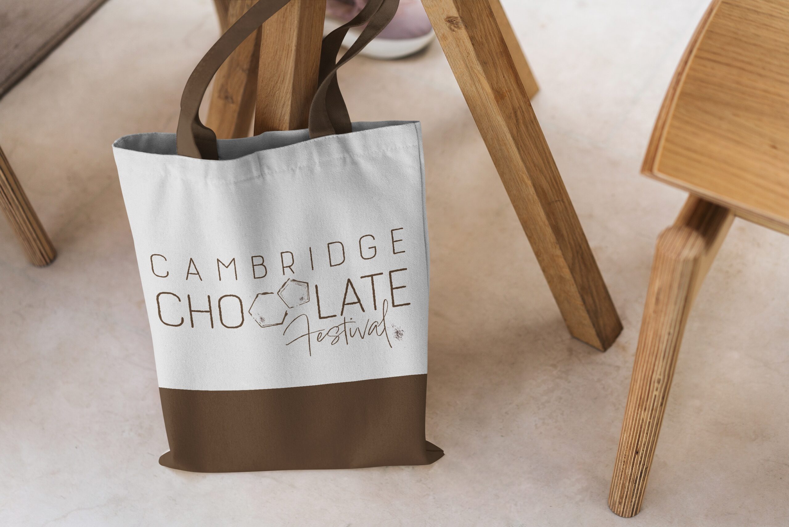
CAMBRIDGE CHOCOLATE FESTIVAL
A logo design contest submission for the second annual Cambridge Chocolate Festival. The festival is held over Valentine’s Day weekend, featuring a variety of stalls including local chocolatiers, bakers, educators, and artisans.
Conceptual beginnings of the logo design rooted in the chemical properties of chocolate as a nod to the innovative culture of science and research in Cambridge, paired with a vintage vibe to acknowledge the down-to-earth, artisanal spirit of the festival.
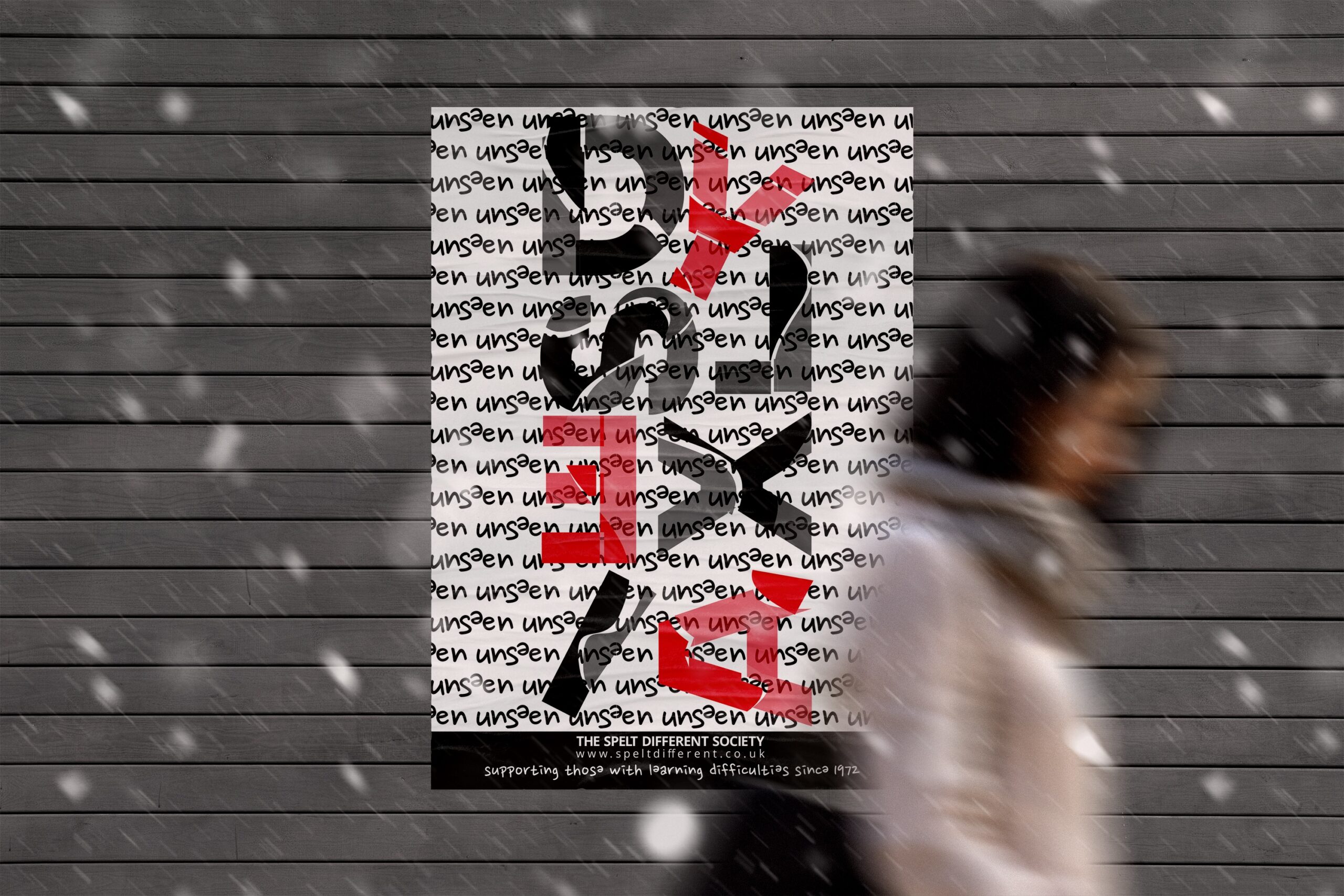
SPELT DIFFERENT SOCIETY
(CONCEPTUAL DESIGN)
The Spelt Different Society (SDS) has been the voice of people with learning difficulties since 1972. Its aim is to influence the government and other institutions to promote a friendly society that enables people of all ages to reach their full potential.
Focusing on the theme of dyslexia being an invisible challenge, the brief was to create a poster showing the point of view of people in the community who feel like their struggles are unseen. From the child at school struggling to keep up with the rest of their friends, to the office worker feeling like they don’t belong.
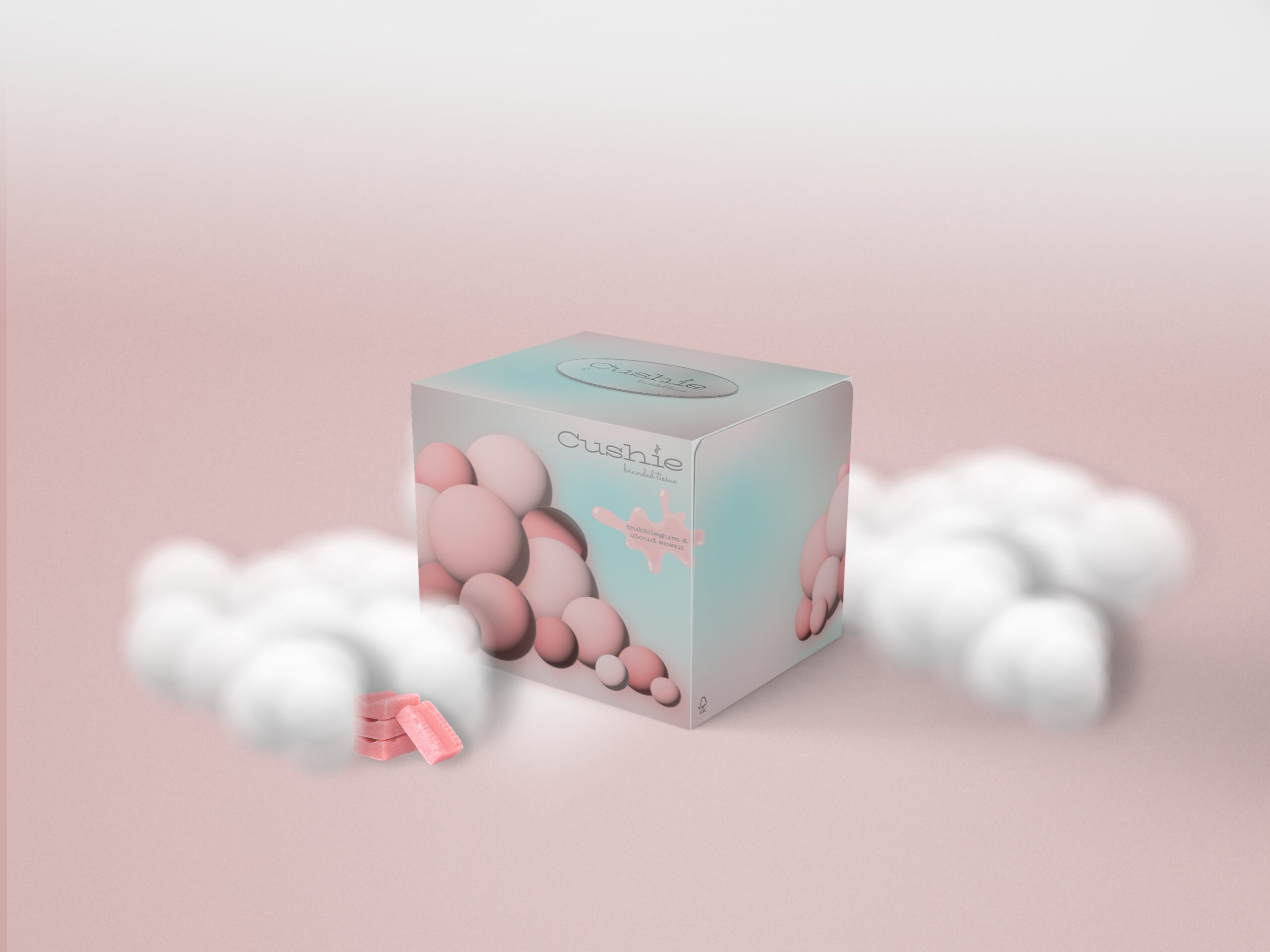
CUSHIES
(CONCEPTUAL DESIGN)
Cushies is a luxury and high-quality toilet paper and facial tissue manufacturer.
The project scope was to design packaging for a new scented facial tissue (bubble gum and cloud).
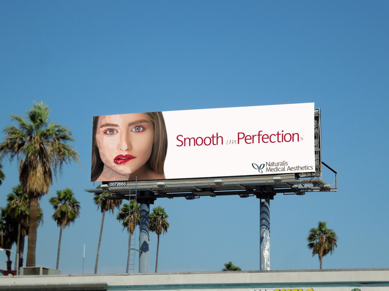
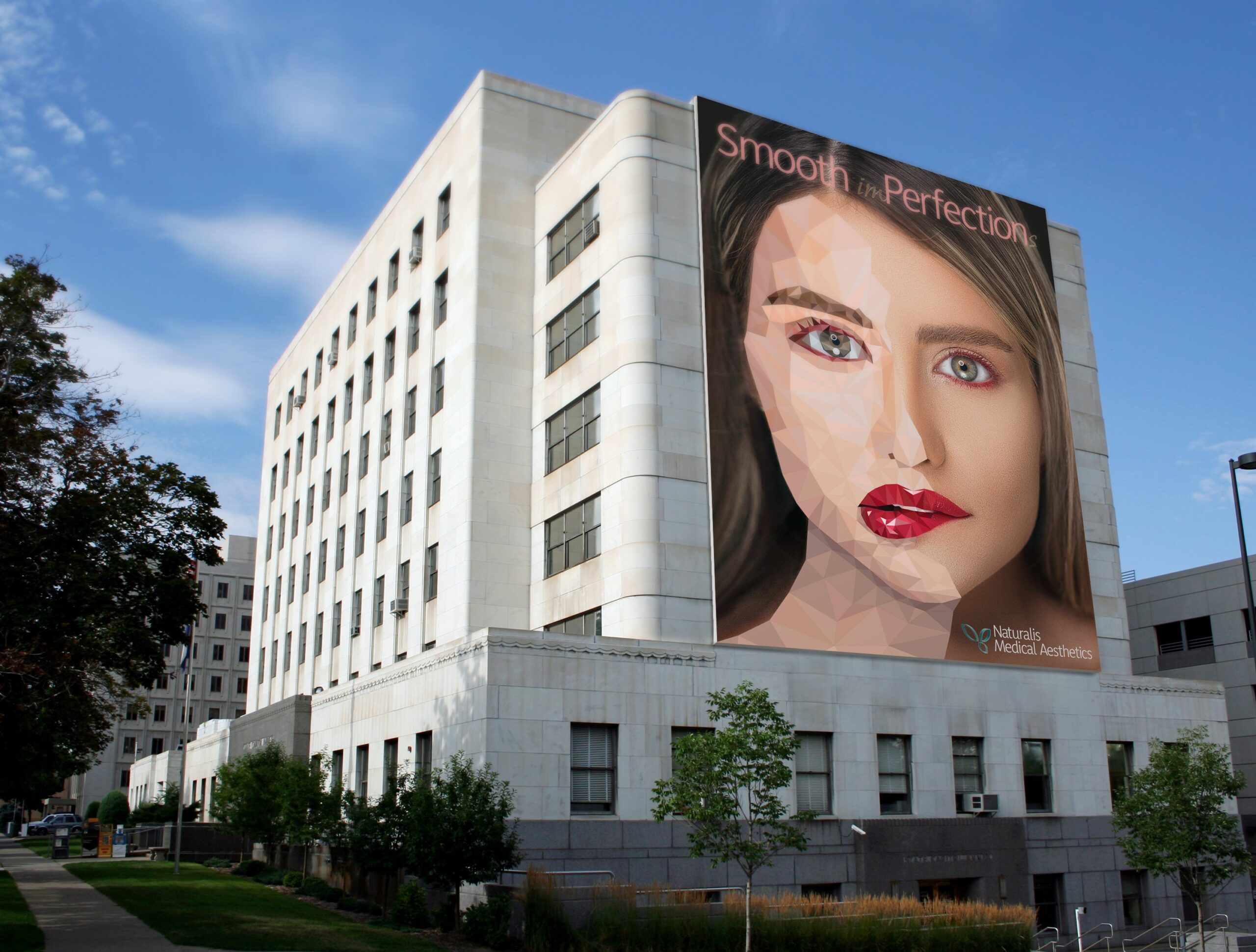
NATURALIS MEDICAL AESTHETICS
(CONCEPTUAL DESIGN)
Naturalis is a medical aesthetics clinic offering a variety of cosmetic treatments, including Botox and fillers.
The brief was to create an advertising campaign for billboards showcasing the transformative effects of cosmetic treatments, while instilling confidence in the consumer in the desire for perfect skin.
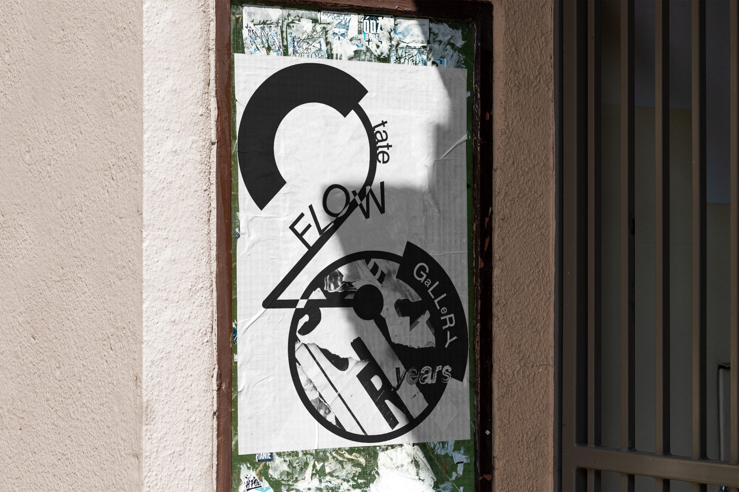
FLOW TATE GALLERY
(CONCEPTUAL DESIGN)
Flow Tate Gallery has been championing emerging talent in contemporary art for over twenty years with a bespoke gallery space and a dynamic exhibition program. It promotes young and mid-career artists who work primarily with typography.
The brief was to design a 20th Anniversary black and white graphic poster, with an emphasis on heavy typography.
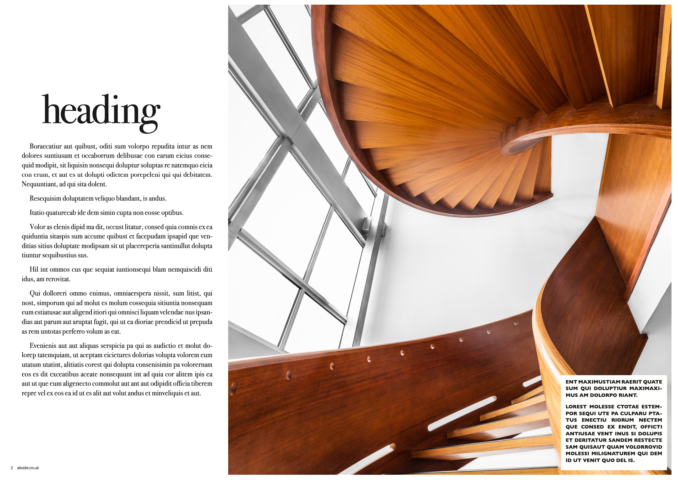
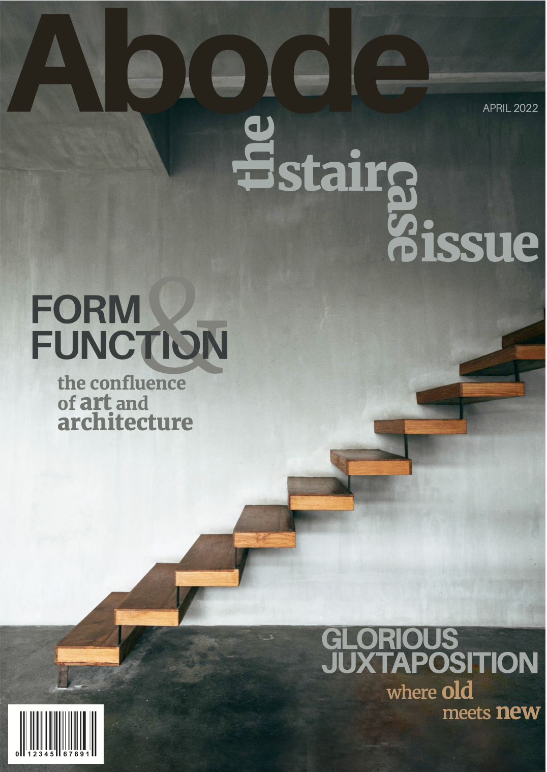
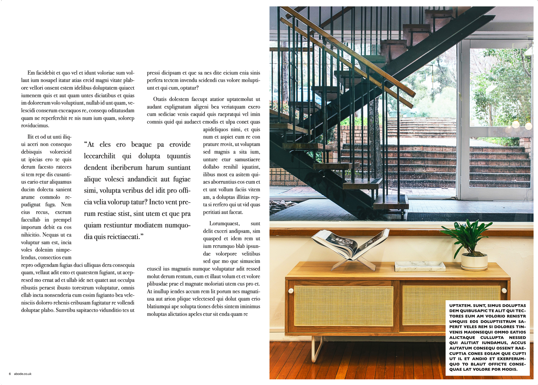
ABODE MAGAZINE
(CONCEPTUAL DESIGN)
The brief was to design the front cover of the special staircase issue, as well an article layout featuring a variety of staircases. Limited parameters were provided, though given the magazine showcases all interior styles, the fonts chosen were to reflect that.
